
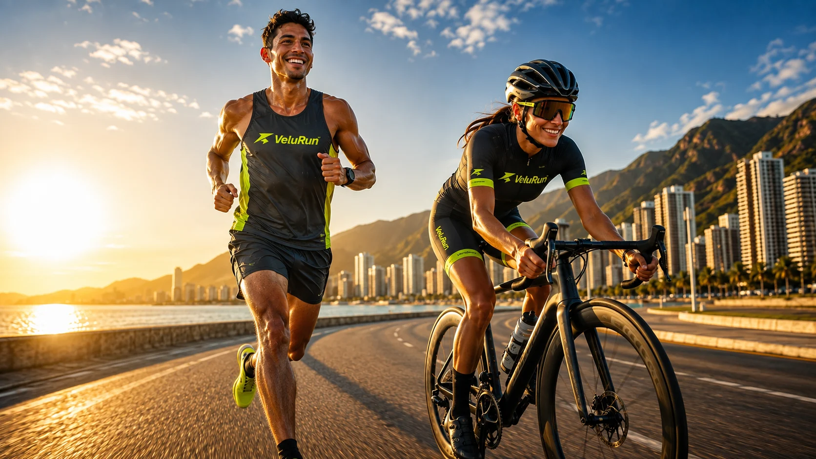
Overview
VeluRun is a GPS running and cycling app built for the LATAM market: two sports in one app, guided interval training, and a GPS pipeline that keeps recording with the screen off. Designed and shipped end to end, from the first sketch to a live listing on Google Play.
Role & scope
Founder, sole developer and product designer. Direction and every final call were mine. Two AI collaborators worked under that direction in fixed roles: Claude drafted diagnostics, prompts and design decisions; Opus — running as Claude Code in the terminal — executed the code, builds and git. Nothing shipped without my review. A three-role system, not a chat — and it shipped a real product to Google Play.
Design system
A token-based system built for glanceable data in motion — outdoors, in sunlight, at a glance.
Six words anchor every visual decision: energetic, technical, minimal, natural, precise, athletic. The aesthetic sits close to Nike Run Club, Whoop and Nothing Phone — sport-grade data, clinical restraint, one accent with character.
PrincipleIf it can't be read in a glance, it doesn't exist.
The app is used in motion, often in direct sunlight. Every live metric has to survive a half-second look. Tracking screens abandon the light UI entirely for a near-black dedicated palette, so white numbers and the lime accent cut through glare instead of washing out on a bright card. The live chronometer runs in Sora ExtraBold at 72px — large enough to read at arm’s length mid-stride. The dark palette on Record and active Train is not a "dark mode" preference — it is a dedicated context for the one moment an athlete cannot afford to squint.
Color
#D4FF37 is the only brand accent in the app — never a second accent competing for attention. Hierarchy comes from weight, size and neutrals instead; lime is reserved for the one value or action that matters most on each screen.
- primary #D4FF37
- secondary #0A1F2C
- bg #F8F9FA
- surface #FFFFFF
- error #BA1A1A
- bg #040f0f
- surface #0d1e1e
- border #1a3535
- primary #D4FF37
The mark
The mark is not a generic bolt. Read one way it is a figure running, seen from the side; read the other, the same silhouette is a cyclist folded over the bars. One angular stroke covering both sports the app was built for — drawn once, not twice.
-
 Primary
Lime ground, navy mark. The default tile and the composition the Android launcher icon is built on.
-
 Dark
The inversion — navy ground, lime mark — for dark surfaces.
-
 Mono
Navy mark on a neutral tile with a hairline edge, for contexts that cannot carry the lime.
Typography
Type is split by job rather than by taste.
-
05:14 /km
Sora 700 · 800 Headlines & numbersExtraBold at 72px on the live chronometer.
-
Ready for your next route.
Hanken Grotesk 400 · 600 · 700 Body & UI -
C O R R E O E L E C T R Ó N I C O
Space Mono 400 Form labelsConfined to Login and Register.
Spacing & shape
- Border
- 1.5px across the whole app
- Radius / light
- 22 on light-surface cards
- Radius / dark
- 16–20 on dark cards
- Radius / pills
- 999 — buttons, tags, toggles
Motion
Motion is physics, not duration. Everything animates on one of three shared springs (react-native-reanimated) — never a fixed easing curve — so gestures stay interruptible and composable, from a single source file.
- SPRING_SNAPPY
- damping 15 · stiffness 220 · mass 0.8Small toggles, icons, button scale.
- SPRING_DEFAULT
- damping 18 · stiffness 180 · mass 1Cards, panels, most UI transitions.
- SPRING_GENTLE
- damping 22 · stiffness 150 · mass 1Full-screen and tab transitions.
Components
A compact set of shared primitives keeps interaction and chrome consistent across every screen.
- PressableScale
- RemoteImage
- ConfirmModal
- InfoModal
- PhotoPickerModal
- ModeToast
- CommentsSheet
- Collapsible
- VeloRunWatermark
Process
Every UI decision started as a mockup before a line of code. Every technical change shipped with a written diagnostic — nine so far — so decisions stayed traceable instead of tribal knowledge. Builds were verified on physical hardware before every release.
Underneath all of it, one principle: glanceable minimalism. Every screen is meant to be read and let go of, never stopped over and interpreted.
-
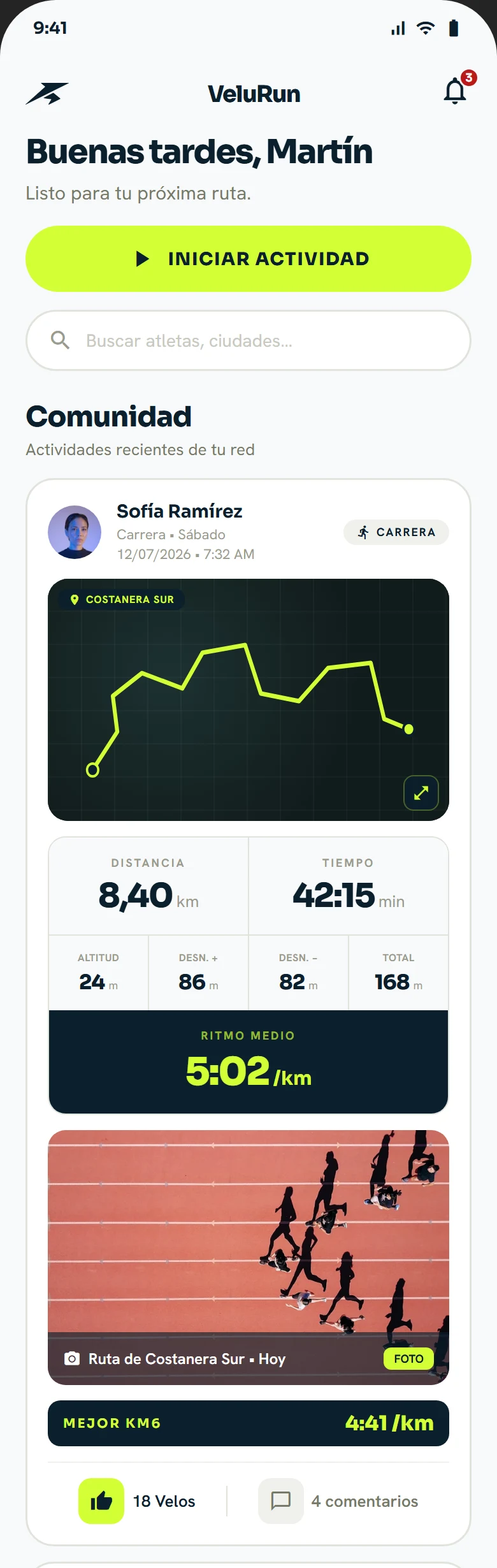 community feed
Every activity, one scannable card
- Function
- Distance, time, elevation and pace lead each card, route photo below, velu reactions and comments last.
- Why
- The numbers carry the card; the social layer supports it, it never has to compete with it.
-
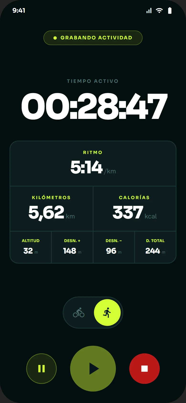 live tracking
Every number in one glance
- Function
- Pace, distance, time, calories, elevation gain and loss, and a run/bike switch — all on one screen while recording.
- Why
- Nothing to tap or scroll for mid-run — the numbers that matter are already there.
-
 after the run
Pace, broken down without digging
- Function
- Last activity, pace per kilometre from KM1 to KM6, best split highlighted.
- Why
- The question people actually ask after a run — how did each km go — answered on the first screen, no separate analytics view.
-
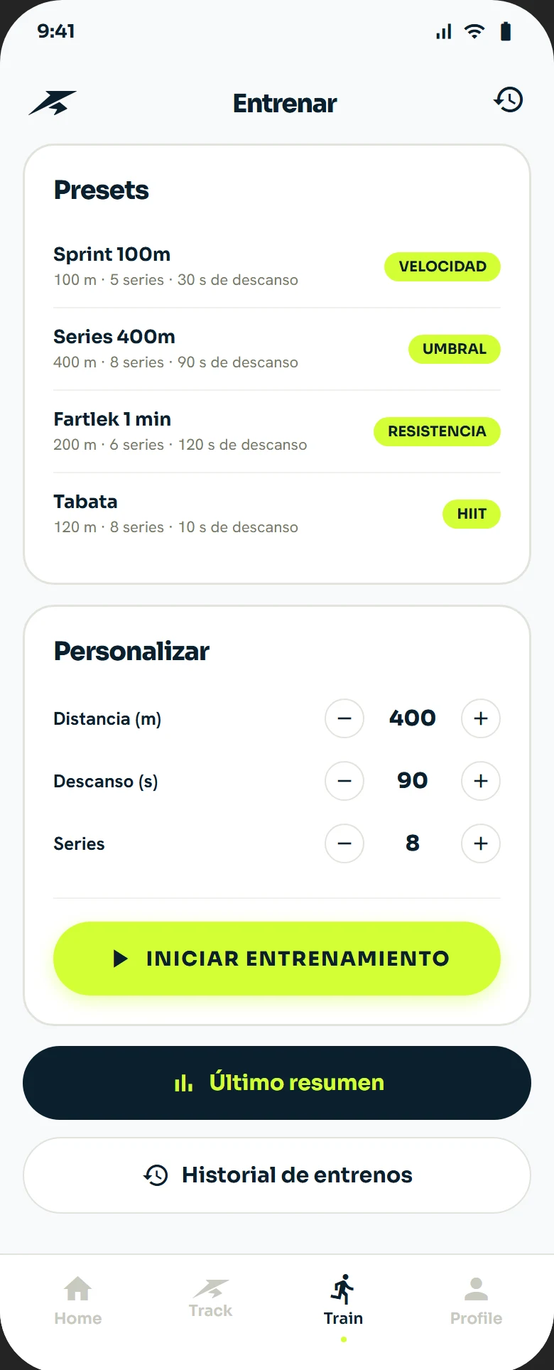 workout setup
Presets over a blank slate
- Function
- Sprint, intervals, fartlek, tabata — grouped by speed, threshold, endurance, HIIT. Custom distance and rest are one tap further, not the default.
- Why
- Fewer decisions to start a session; customization stays available, just not first.
Community
Running and cycling stop being solo the moment someone sees what you did. Every profile connects to others, every activity shows up for your connections to react to with a velu — VeluRun's own reaction, not a generic like — and comment on. Community infrastructure for creating and joining groups inside the app is already wired end to end; it's built and ready, just not turned on for this first release.
-
 the feed
The feed is the social layer
- Function
- One activity, top to bottom: the mapped route, distance, time, pace and elevation, the photo from the run and the fastest kilometre splits.
- Why
- Seeing someone else’s real route and splits is the cheapest motivation there is — the feed puts it one tap from your own start button.
Key challenges
-
A security finding that became a full audit
- Problem
- A Supabase view was readable without a session.
- Decision
- Escalated to a systematic RLS and grants audit across the whole schema instead of patching the one table.
- Outcome
- Two critical and one high-severity finding closed, 10 tables hardened, and the photo storage bucket moved from public to private with 1-hour signed URLs.
-
GPS that doesn't drop out
- Problem
- Background tracking with the screen off needed to survive aggressive OS battery optimization and still produce a smooth live pace.
- Decision
- Batched, ordered location processing with a seed-fix staleness filter, anti-teleport checks, and short-window EMA smoothing on live pace.
- Outcome
- Verified on a clean Play Store install, tracking surviving screen-off periods.
-
Auth with the smallest footprint
- Problem
- SMS OTP is expensive and fragile across LATAM carriers.
- Decision
- Email-only six-digit OTP through Supabase Auth — no phone numbers, no custom auth backend.
- Outcome
- One auth path to test and support, shipped in four languages.
Results
Live and stable — usage metrics are still early; this section grows as real numbers come in.
What's next
Real-world GPS validation outdoors, AdMob activation, and a connected sportswear line under the same brand. The biggest lesson: shipping solo doesn't mean building alone — it means being explicit enough about every decision that the record does the remembering for you.